Mobile Websites and Its Types

Mobile websites are the same websites which are viewed on our desktops. The only difference is that desktop has larger screen, which fits according to the dimensions of its screen, whereas mobiles have its screen according to its size as the website is reduced to the dimension of the screen of any device.
We have mainly five types of mobile websites which have their pros and cons.
Here are the five categories:
1. Responsive:
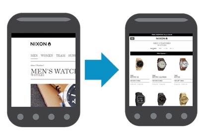
It is also termed as ‘liquid’ design. It conforms to the height and width of the device you are using to view the site. To help the viewers from having difficulty of scrolling left or right, or need to zoom, it will morph the content.
Based on the dimensions of the device on which you are viewing a site, a responsive site resizes page content and images for your convenience.
2. Mobile Friendly:
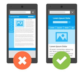
Even if a website is viewed on small screen devices such as mobile phones, there is no change in its content and made easier to use. The website won’t fail to load and the size is adjusted accordingly.
3. Adaptive:
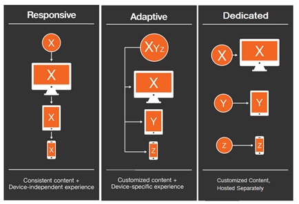
This is the style that changes the design of your website as you resize your window. That means the site is adjusted according to the size of the window. Any website that follows the adaptive design re-arranges the page elements based on which device it is being displayed.
Predefined screen sizes are the important factors that an adaptive design is based on. Here the code of the site is created in such a way that content is automatically arranged according to the display size.
4. Native:
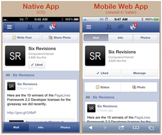
It is basically an app. An app is a completely coded, engineered web-based program which is specially made to run on mobiles. An app needs to be programmatically created to provide services to the user. There is, of course, a lot of difference between the native mobile sites from the desktop websites.
Fulfilling the need of the client is the main motto of a native app. Some native apps require an Internet connection to run, and some offline native apps don’t need.
It is important that you define a set of questions such as: what is the purpose of your app? Is it an interactive/ informative site or a game? Do the app charges when accessing it? Will it work on all platforms and devices?
5. Experience:
It is made in such a way that a site will be displayed on a specific mobile device. This, of course, will lead to the designing of separate code and structure for the site. Some sites which are made exclusively for mobiles can’t look good on desktops and other devices because they are not made for that.
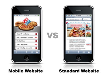
There are also other kinds of sites which are not compatible with the mobile sites at all. They don’t load on some types of mobile devices, which fall under the category “not mobile in any way”. An example of it can be a Flash-driven restaurant menu sites.


