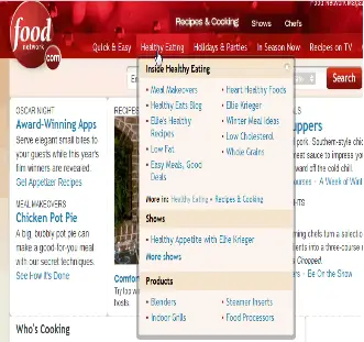
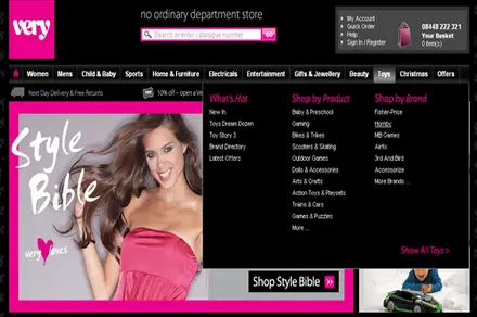
Drop Down Menu Importance for Websites:
Drop down menu is a way of adding more attractiveness to your website. It allows users to easily find the required information inside the site. Good display menu for a website results in all over benefits of users as well as creator or founder of site. Clear purpose of website in easily identified through drop down menus. Drop down menu not required much skills rather basic knowledge of how to create it, knowledge of CSS and JavaScript is necessary. Pure CSS menus all users to see menus on those browsers which not supports JavaScript.
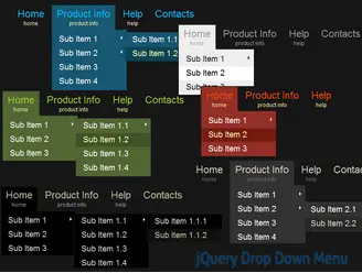
Websites with a lot of data required multiple levels of menus dispersed on simply pointing to specific menu list. Headers without menus are less efficient and miss a lot of information required people must see them. Clear and efficient layout of menus allows users to choose quickly and browse their required information. Efficient menu list makes users to spend more time on specific site and clicks or more information and chances of products or services selling become quickly high.
Through drop down menus website owners of companies easily tell about their products through showing it in submenu, websites with a lot of pages are easily managed, now the usage of blogs are increasing and more and more drop down menus are using in blogs required stylish and efficient menus list with single, two, or three panel lists.

Drop down menus are also look efficient in creating modules for a website. However lot of mistakes done by the website designers in creating drop down menus. Drop down menus should be properly sequenced under each main menu. It should be matched and heading comes under it are also relate to each others.
More than two levels are used by the mostly sites which users find difficulty in search and always results in dissatisfactions. Single levels are more accurate way of providing user-friendly menu lists. Designers should design menu list through focusing on the users and putting themselves on users place and thinking about them.

Menus which are not clickable are not displayed on pointing are also results in negativity. Menus should load quickly on pointing cursor to the desired menu.
Proper headers and menu background color, text color and format, borders design, hover and shading effects should be properly understood and managed before launching any site.
Here few sites with more informative and excellent example of drop down menus:
