There are times where your page has fantastic content but have something missing out of it. Do you know that a website’s design matters a lot for SEO ranking and users to search? Yes, and there are at times we have come across poor design structure of a few WebPages. The following ten values can be useful for what to be avoided in a website’s design.
1. CONFUSION:

Choosing your theme, its color, and the interface is still a big challenge even for large-scale online business set-ups. In the chance of adding things on your site, you showcase all you’re the available shades of color and layouts which may appear completely irrelevant. Avoid this as they make the user confusion about what your brand is doing for them.
2. NOT KNOWING THE WHITE SPACES:
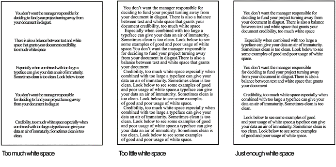
You must keep in mind that not all users will go through your webpage completely. They sometimes have to skim up information. So avoid having just a wall of information put upon it without having spaces and sentence gaps in the necessary areas.
3. CONTENT MATTERS:
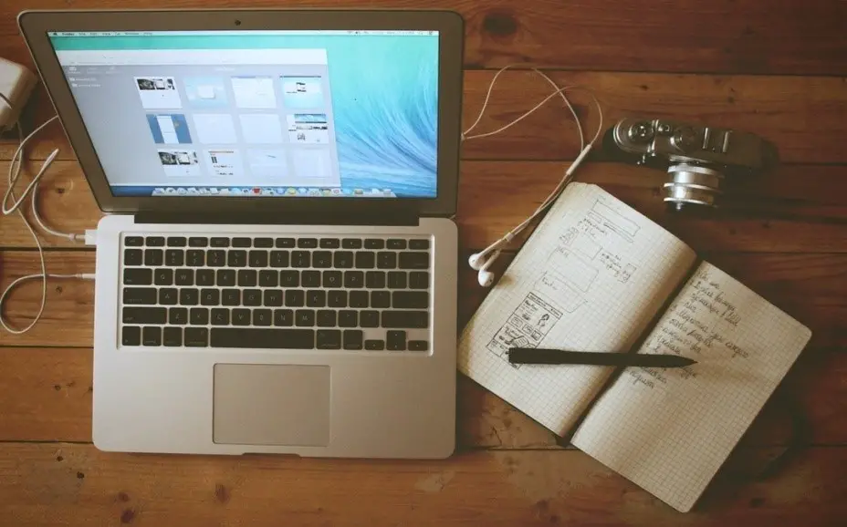
Your content is what speaks the loudest inside a website and know that having too much of it and also minimal of it is going to lose your customers. Know the exact limit of using words, depending solely on what your site is all about. It is good to have some neutral content for a good ranking.
4. IRRELEVANT PICTURES:

Having low-quality images, bad version of pictures and irrelevant content of photos are all examples of bad website design. Try to avoid them primarily, since users tend to have their eyes first on the visual parts of a page and your image will be the one to showcase itself to brand and promote your site.
5. NO CTA:

After reading through your site, a user must become your customer. To attract them, use a forcible Call-to-action at the right end of your page. Even the most highly ranked website without a CTA may lose their count of customers as people just come, read through, and leave off the site like a visit.
6. FONT SIZE AND COLOR:
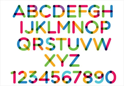
Having good content for your page with proper images is handy, but making them appear dull and lifeless makes your site go off the plane. Choose the vibrant of color or just go with pitch black for making your texts look bold and sharp. It is what that makes your brand what they are really.
7. SOCIAL MEDIA LINKS:
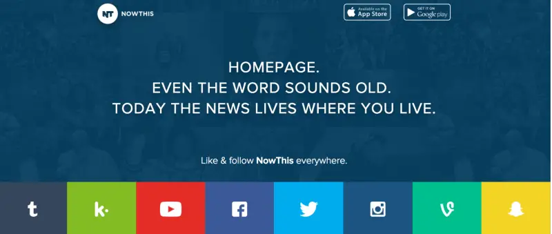
One of the best examples for a worst website design mistake comes when you have all your social media links at the top of your page. You may lose your customers as they simply enter into the social aspects to know about your site instead of spending time reading your webpage. Make sure you have your media links at the bottom of all the text.
8. MOBILE-FRIENDLY SITE:

Having a site that opens and looks well only in a system is out of your hand, as you may say bye to your customers who can gather around through sing your page online from a mobile phone. So have a website which is mobile-friendly.
9. LOADING TIME:
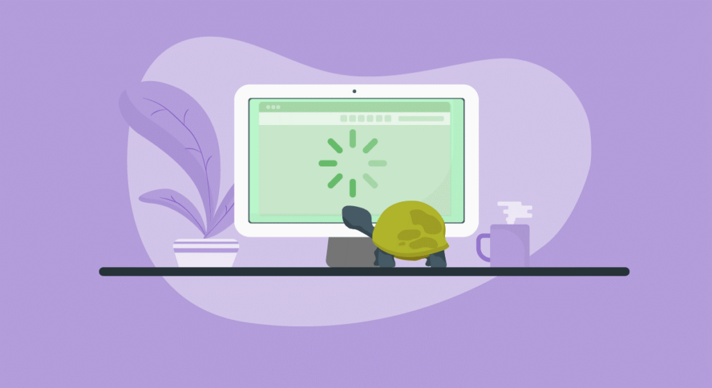
The longer loading time of your page is also an indirect fault in your site’s layout or design. Who enjoys wasting time on a slow-loading page? Even the best quality page may go somewhere without pace. Have the quickest loading time possible for your site.
10. NAVIGATION MISTAKE:
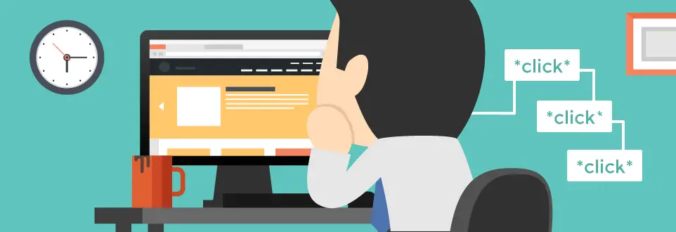
When the user does not get what they came for or cannot locate to the search space on your site can eventually make your webpage’s ranking go low. You are losing potential customers and even users whenever they cannot get what they want for online. Ensure you use the navigation features on your site as simple as possible to make the work of users easy.


