An efficient dashboard involves presentation of crucial data in a precise and meaningful way to help users make interpretations easily. A well-designed dashboard allows businesses to analyze data and make quick decisions based on facts.
A business dashboard represents business’s key data and information using data visualization techniques. It also helps to monitor business statistics and key performance indicators.
Data visualization is a crucial factor to consider while designing dashboards. It involves the presentation of data using images and graphics. It helps analysts quickly identify and interpret patterns that are difficult to analyze with text-based applications.
Dashboard comprises of various elements including icons, chart, and tables that are utilized for the presentation of crucial data. Dashboards can be easily customized as per user preferences.
A business dashboard guides in decision-making process. A comprehensive dashboard eliminates the need to use long excel tables to summarize the data. By utilising creative and appealing charts and tables, dashboards helps in easy interpretation of complex data.
The advantages of creating a dashboard are:
- With its visual representation of even the most complex business data, users can easily interpret and gain visibility into an organization’s performance.
- Dashboards display updated results and help save time and money to run and format individual reports.
- By providing valid and up-to-date information, it helps businesses to make informed decisions.
- Organizations can closely monitor employees and maintain a track record of their performances using the dashboard.
- It helps businesses identify significant patterns and trends that will drive future business growth.
Let us check the top 10 practices for building an efficient dashboard.
1. Know Your Audience
Businesses should identify their target audience and the purpose for which they are going to use the dashboards. They should think like their audience to understand their behavioural patterns. Creating simple charts will help target audience to understand and interpret the dashboard’s data quickly. If the required information is clearly presented using charts and tables, then users will not have to spend hours in data analysis.
Interaction with target audience helps in better understanding of their preferences and choices. Companies should check if the information displayed on the dashboard is clear enough to enable users to interpret the data efficiently. They should make necessary changes in the layouts to make the dashboard more precise and approachable.

2. Check Display Font Size
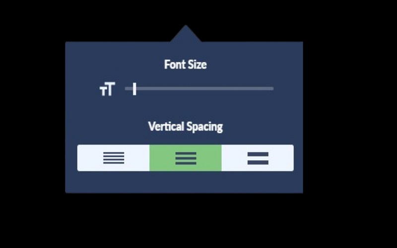
The font sizes in dashboards should be large enough to ensure readability on both mobile phones and desktops. Businesses should plan some researches in advance to identify what all devices the target audiences are using to view the dashboards. Font size settings are adjusted from left side of the dashboard pane. Either the size is set to Automatic mode or a range is specified. Businesses can also utilize Device Designer tool to design the dashboard for different screen sizes.
3. Determine Goals For Designing
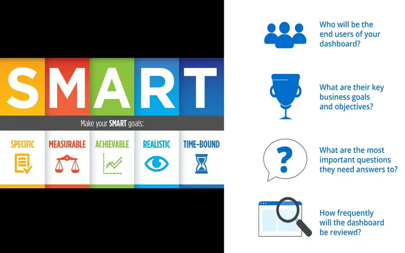
It is crucial for organizations to determine the goal for which they are going to create the dashboard. By utilizing S.M.A.R.T framework, businesses can plan and establish their specific goals. They should identify the number of steps users must take to achieve the goal. They should also check and verify if their designs are interactive enough to allow users achieve their goals efficiently. Businesses must identify the type of information the user needs to accomplish their goals.
4. Prioritize Layout Design
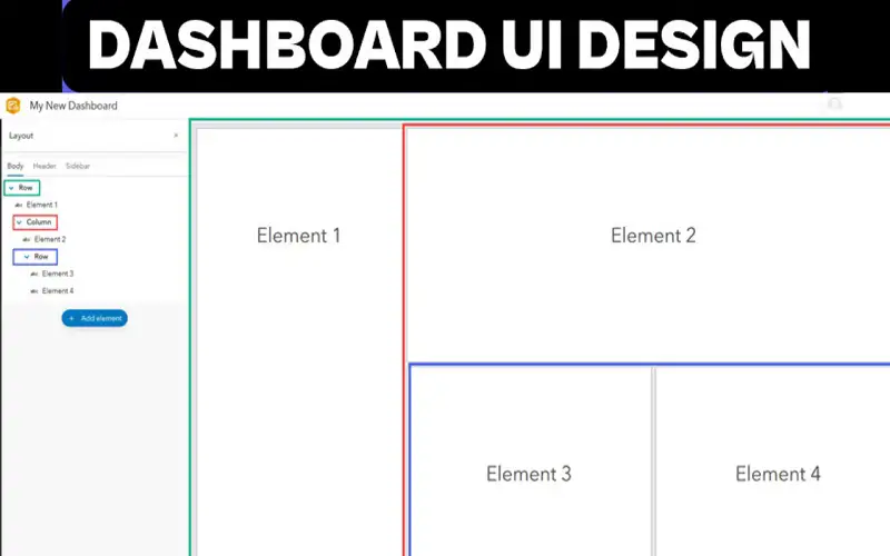
Once the data identification process is complete, the next step is to design the layout of a dashboard. Companies should prioritize information that are of utmost important to users and place them on important positions of the dashboard. The positions that attract most attention on the dashboard are the top and the bottom section. Businesses should focus to place their visuals and interactive elements on the top and bottom sections of the dashboard. They can also draw rough sketch of the dashboard before designing a final layout.
5. Build A Story With Your Data
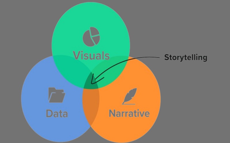
Data storytelling is one of the best practices for designing an effective dashboard. In dashboard storytelling, data is presented visually to illustrate entire narrative of a data analysis process. It helps in better understanding of business goals and strategies. The storytelling method aids team members who are not trained enough to perform data analysis. To facilitate storytelling, companies should design their dashboards in advance to plan what all information to include and what not.
6. Include Interactive Elements
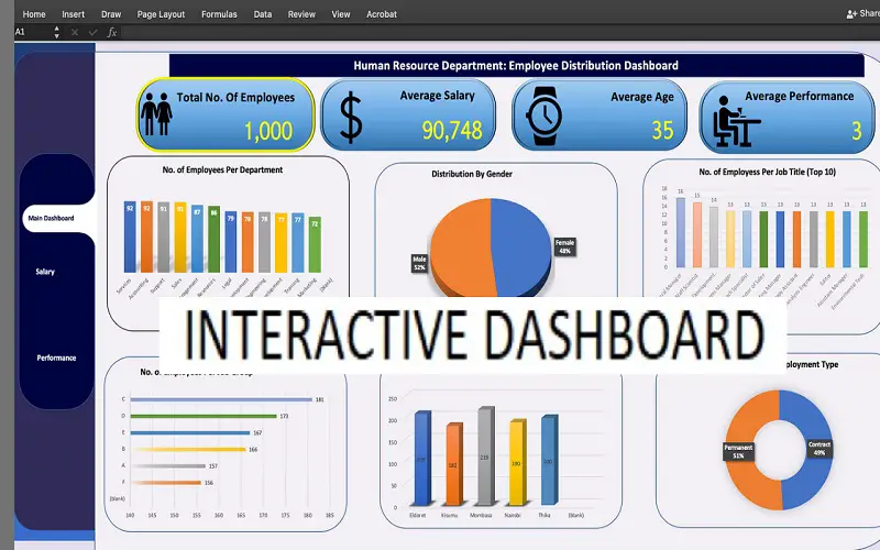
Businesses can create innovative dashboards using interactive elements. Adding interactive elements to dashboards lets users navigate and sort the information easily. Using PowerBI, businesses can also decide how visuals will interact with each other. PowerBI combines software services, apps, and connectors to transform raw data into a visually interactive dashboard. It offers businesses complete control over their dashboard and make decisions effectively.
7. Plan For Faster Loading Times
In today’s busier times, waiting hours to load and view information can frustrate users. No matter how visually appealing your dashboard is, if its loading speed is slow, then it will create displeasure for viewers. Applying too many filters may lead to slow loading times and impact query performance. Set filter options carefully to maintain the speed. You can also use “Filter Your Data Carefully” option available in the Tableau to adjust the filter options.

8. Choose Your Dashboard Type
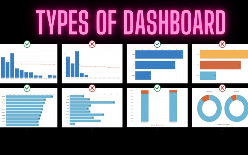
Choose the correct type of dashboard based on its analytical purpose. Each dashboard serves different user group. Businesses should ensure that their dashboard is highly responsive and suit all screen sizes. There are mainly five types of dashboards available, including Strategic, Operational, Analytical, Platform-specific, and Tactical. Based on their preferences, businesses can choose from any one of these types to design a dashboard.
9. Identify Relevant KPIs
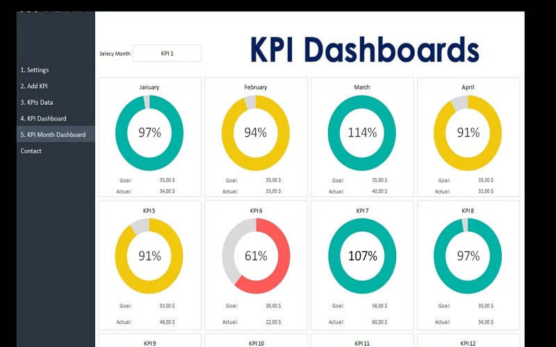
Businesses should select the right set of key performance indicator based on their requirements. Once the goal is set and target audience is identified, organizations should choose the best KPI set for their dashboard. Key Performance Indicator plays a crucial role in determining your dashboard’s direction. They provide a visual representation of relevant information based on specific aspects of the business. Using Key Performance Indicators, businesses can also track areas that are underperforming and make necessary changes.
10. Implement Progressive Disclosure
To reduce error rates, companies can implement the Progressive Disclosure technique while designing the dashboards. The Progressive Disclosure technique helps to minimize clutter and maintain user attention. It focuses on creating a centralized user environment that prioritizes user attention and relevant vital features. Progressive Disclosure keeps rarely used features away from the dashboard and focuses on including features that matter most to the user. This results in the better understanding of dashboards and enhanced efficiencies.
