The Difference Between CSS and CSS3
We use different styles and long lines of code to make our website more attractive. But with CSS3 effects, we can make our website look more interactive and stylish in a single line code. To be an effective web designer you need to welcome different new styles on your websites.
Top CSS3 effects are:
1. CSS3 Border-Image Property:
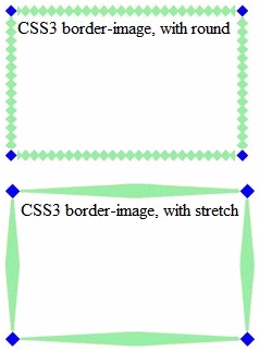
Instead of the normal border around an element, through this CSS3 border-image property, you can specify an image around the element.
This property has three parts:
- The image which we need to use as the border.
- Where the slicing should be done.
- Specifying whether the middle sections should be stretched or repeated.
In this property, the image is made into slices and placed it in the corners of the element. We need the border property set to make this border-image property work.
2. Shadow Effects:
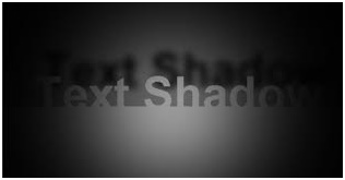
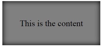
The new and interesting feature of CSS3 is that it can provide shadow effects. This makes the web page look neat and decent. You can add shadow to elements as well as to the text.
There are two properties of this feature:
- Text-Shadow: This adds a variety of shadow effects to the text written in different fonts.
- Box-Shadow: This adds shadow effects to the boxes or boxes with the text.
You can always choose colours for those shadows, and you can also apply multiple shadow effects to each element.
3. CSS3 Transforms:
We can skew, translate, scale, and rotate the elements such as boxes or images. The specialty in this feature is that it can rotate, change shape, size, and position of the element.
CSS3 supports 2D and 3D transformations. We can see these features working when we mouse hover on that element.
A. CSS3 2D Transforms:
2D transformation methods:
- translate(): Used to move an element from its current position.
- matrix(): With this, you can simultaneously skew, scale, rotate, and move the elements.
- scale(): You can increase or decrease the size of an element.
- rotate(): This rotates an element clockwise or anti-clockwise depending on a given degree.
- skewX(): This is used to skew an element by the given angle along the X-axis.
- skewY(): This is used to skew an element by the given angle along the Y-axis.

B. CSS3 3D Transforms:
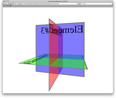
You can format your elements using 3D transformations. There are three transformation methods of 3D:
- rotateX(), rotateY(), rotateZ()- It rotates an element around its X-axis, Y-axis, and Z-axis respectively at a given degree.
4. CSS3 Animations:
Without using Flash or JavaScript, CSS3 animations allow animation of HTML elements.
- Through animation, we can gradually change different styles.
- You can even change CSS features for a unlimited number of times.
- You need to define some Keyframes for CSS3 animations.
- Keyframes will hold particular style of the element at that particular time.
The @keyframes Rule:
The animation will gradually change the styles at certain if CSS styles are put inside the @keyframes rule. The element must bind within the animation to make any animation work.
