Front-end or client-side development builds a website’s User Interface (UI), which dictates how it looks and works. UI involves visuals and user interactions. The front-end includes buttons and other UI components, media, messages, forms, animations, Etc. It isn’t the only route to becoming a Front End Developer. Instead, it’s a guide for front-end developers.
1. Graphics Work
It’s rare to conclude a project and save every aesthetic change in the design files. Unfortunately, designers aren’t always available for quick fixes. Any front-end task requires aesthetic modifications. Front-enders often handle seemingly simple jobs, such as making a tick for a checkbox or a page layout the PSD overlooked. Of course, this wouldn’t be the case in a perfect world, but I haven’t found one, so we must be adaptable.
2. Match, Don’t Beat The Design
Your aim isn’t to make a unique checkmark; it’s to fit the design. Those without much design experience may be enticed to add seemingly insignificant features. Designers should handle that.

3. Typography Matters
You’d be shocked at how much typography influences design. You’d be amazed at how long designers spend on it. This isn’t a “pick-it-and-go” project; it takes time and effort. If you must choose typography, take your time. Research font pairings online. Spend some time pairing fonts to find the best one for your project. Also, use suitable typefaces. For example, if the designer uses Georgia for headers and Open Sans for the body, you shouldn’t. Instead, typography can easily ruin aesthetics. Match your designer’s typeface. It’s worthwhile.

4. Front-End Design Can’t Be Tunnel-Visioned
I’ve been making checkmarks for custom checkboxes without showing them marked. Remember that you’re making minor components of a larger design. As crucial as a checkmark on a page, no more, no less. So please don’t make your part something it isn’t. You can examine how it affects other design components on the page and if it suits its job.

5. Relationships And Hierarchy
Pay attention to design hierarchy. How close are titles to the body? Are they close to the text above? How does the designer show which elements/titles/text bodies are related? The box has relevant content, uses white space to highlight relationships, similar or contrasting colors to represent related/unrelated content, Etc.
6. Be Cautious About Whitespace And Alignment
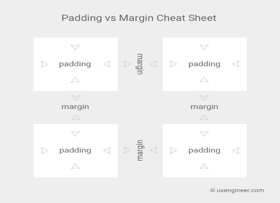
This is a beautiful tip for enhancing designs or implementing others’ methods If the plan uses 20-unit, 40-unit, Etc. Spacings, ensure sure every spacing is 20 units. This is an easy way for someone with no aesthetic sense to make a significant change. Ensure your elements are aligned to the pixel, and their spacing is uniform. However, where you can’t (like where you need more space to demonstrate hierarchy), make them exact multiples of the spacing you’re using elsewhere.
7. If You’re Not Sure, Do Less
Less is more if you’re unsure about your design skills and need to add something. For example, the designer did the preliminary work; you only need to do minor details. So if you’re bad at design, do as little as possible to make that piece work. This method introduces less of your own design into the designer’s work.

8. Time Fools Us All
Ninety percent (or more) of what they put on paper or Photoshop is terrible. They toss more than you see. It takes many revisions and tweaks before allowing the person in the next cubicle to see their work, let alone the client. There are many iterations between a blank canvas and a successful design. People rarely produce good jobs until they realize and account for this. One of the best designers I know goes this idea far further. First, he’d make three designs. Instead, he’d wait 24 hours, look at them again, then start a fourth from scratch. Next, he remained a day between iterations while it improved. Only after he was happy, or as comfortable as a designer can be, did he deliver it to the client. He used this method for every design, and it worked brilliantly.

9. Pixels Rule
Certain things can’t be flawless. For example, your letter spacing may not be as perfect as the designer’s, and a CSS shadow may not match a Photoshop one, but try to come as near as possible. Pixel-perfect precision is possible in many design elements. However, it can make a tremendous difference. A pixel here or there may not seem like much, but it affects the overall appearance more than you think. Keep watch. There are [tools] that assist you in comparing initial designs to results, or you can copy and paste screenshots to compare each aspect. Just put the screenshot over the design and make it semi-transparent to compare. You’ll know how much to tweak to get it right.
10. Get Feedback
It’s hard to gain a “design eye ” and accomplish it alone. It takes courage, but it’s one of the best ways to develop the project and your skills. Even if you need to tweak a checkmark, many people will help. Find a designer friend or an online forum to receive Feedback. I don’t mean to ask your neighbor for advice; I mean to allow expert designers to analyze your work and make suggestions.
