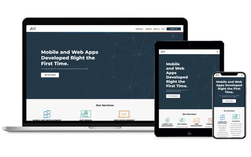
With over 60% of website traffic now originating from mobile devices, having a mobile-friendly website is no longer just an option, it is a necessity for any business looking to effectively reach today’s on-the-go consumers. However, creating an optimized mobile experience requires more than just squeezing your desktop site onto a small screen. There are key considerations around usability, functionality, and performance that warrant evaluation to provide users with a smooth and seamless journey tailored for their handheld devices. I outline the top 10 mobile-friendly website design tips business owners and developers alike should keep top of mind when looking to enhance overall user experience.
1. Design For The Device
Today’s consumers access the web through a wide variety of mobile devices, from small-screen smartphones to seven-inch tablets. Designing for the device means accounting for the unique display properties and functionality each presents. Most smartphones feature vertical, portrait mode screens between four to six inches measured diagonally. Tablets offer more real estate with screen sizes ranging from seven to over 12 inches. Understanding how interface elements render across formats, and appropriately scaling text size for comfortable readability are central to mobile site optimization.
2. Highlight Your Calls-To-Action
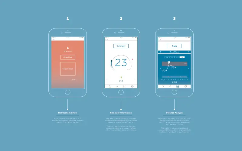
Driving conversion is the primary goal of most business websites. On mobile sites, clear calls-to-action (CTAs) are essential for users to easily take intended actions like making a purchase, downloading content, or submitting a form. CTAs should stand out visually using high-contrast colors, borders, and whitespace to differentiate from surrounding content. Ensure CTAs are prioritized “above the fold” without excessive scrolling needed to find them. Apply rankings, with your most important CTA, like “Add to Cart” appearing before secondary actions.

3. Reduce Forms
Completion of web forms is significantly more tedious on mobile devices, especially when typing on tiny touchscreen keypads. Every field you ask users to fill out increases abandonment likelihood. Strip down forms to just essential information, using smart defaults where possible, like auto-detecting a user’s location to prefill city and state. Allow users to scan credit cards rather than painstakingly enter long card numbers. Replace dropdowns with taps to select options for faster choice-making. Apply client-side validation upon field exit rather than after full form submission to provide real-time error messaging Specific to phones, ensure forms scale responsively for easy viewing and interaction in vertical orientation.

4. Use Images Cautiously
Visually rich web designs degrade the mobile experience when not optimized for smaller viewports. High-resolution images require extensive downloading that is exponentially slower over cellular networks compared to WiFi, resulting in excessive page load times. Determine must-have imagery, scaling assets appropriately so they don’t consume full device width. Set explicit image dimensions in HTML rather than relying on auto-resizing for faster rendering. Compress file sizes as much as possible without losing quality. Replace generic stock photos with custom images directly relevant to your offering for a more memorable impact. And provide useful alt-text descriptions for accessibility across users of all abilities.

5. Optimize Your Mobile Website For Speed
Page load speed has a significant impact on user experience and conversions. With over half of the visits being abandoned, if pages take over three seconds to load, optimization is mission-critical. There are several technical performance checks including minification to reduce file sizes of HTML, CSS, and JavaScript assets sent over the network. Enabling browser caching allows users to load common code libraries from local storage rather than external sources upon subsequent visits. Compressing images without quality loss, removing unnecessary redirects and optimizing databases through actions like indexing also meaningfully improves speed.

6. Keep Typography Clear And Concise
Small screens constrain how much text users are able and willing to read at one glance. Refrain from dense paragraphs spanning multiple sentences that require extensive scrolling on phones. Break content into digestible chunks, using list formats with ample whitespace between groupings whenever applicable. Limit body text to concise phrases rather than lengthy descriptions. Use clear hierarchies – changing font sizes, colors, and styles – to differentiate section headings and supporting content for immobility. Verify sufficient contrast between text and background colors for legibility.

7. Simplify Your Navigation
On desktop sites, top navigations can support menu depths spanning across horizontal tiers. On mobile, you don’t have that luxury without eating up precious screen real estate. Determine your site’s critical pages, consolidating or removing non-essential ones from the main navigation for simplicity. Use expandable accordions to house secondary menus, and formatting options with adequate touch targets for fingertip control. Position key sections within easy-reach areas like page header or footer to minimize panning and scrolling.

8. Add A Search Option
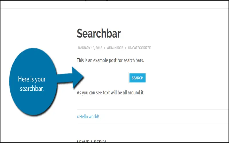
Enabling onsite search improves discoverability allowing users to locate information without excessive navigation steps. Formats ranging from basic search boxes to predictive search with results appearing dynamically as users type each character offer helpful lookups. Deploy search features consistently across pages, ideally placing them within page headers to keep them prominently visible. On results pages, format returns segmented by content type -product listings, support articles, blog posts, etc. – adding facets to filter by attributes like price or product type to quickly drill into relevant groupings.
9. Use A Mobile-First Approach
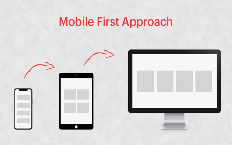
With mobile poised to overtake desktop browsing in the coming year, taking a mobile-first approach to web design is an increasingly prudent starting point. Rather than retrofitting desktop sites which often requires significant rework, architect your base experience based on mobile constraints first. Then progressively enhance layouts to leverage more real estate tablets and desktop formats. Mobile-first frameworks using CSS Grid, Flexbox, and similar methodologies make achieving responsive behaviors easier. Plus testing intricacies around tap targets, typing assistants, and other mobile interactions early in development reduces bugs that would require future remediation.
10. Make Your Website Mobile Responsive
While reducing desktop layouts to fit miniaturized screens enables basic mobile accessibility, responsive design takes optimization much further. Content dynamically scales not just for consistent rendering across devices, but by leveraging media queries, can change layouts based on a device’s distinct viewing characteristics. For example, reshuffling page sections into a single-column layout better accommodates vertical phone screens vs the multi-column grids leveraged at wider desktop widths. Imagery can fluidly scale and captions reposition based on available space. Navigation menus can collapse into small tap targets on handsets yet expand to multi-tier horizontal formats on larger screens with pointer-based control.
