Logos are the intimate indication of a company. It is an image which has the power to speak for itself and properly represent the company. Logo designing is a very creative and tough job requiring a lot of people and some sessions of brainstorming. The entire image of the corporation depends on it. People should be able to identify the name of the company just by looking at its logo, and it must also define the company’s ideas and works according to the generation.
Here is the list of 10 logo changes which brought a lot of chatter at the market.
1. Microsoft
Most people don’t know that Microsoft changed their logo four times before settling on the one which we see today. The four-colored design was unveiled in 2012 when Microsoft and Microsoft Windows were thought to be one and the same thing by a majority of the people in the world.

2. Nokia
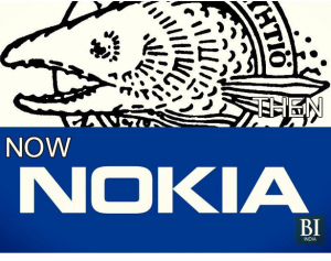
Nokia did a lot of things before becoming a dedicated mobile company. Founded back in 1865 in Finland, Nokia started as a paper mill powered by water, it then ventured into making boots, snow tires, and electrical cables. The fish in the logo represented the Nokianvirta River in Finland but was changed to the current logo since it stopped making boots and started “Connecting People”.
3. Google
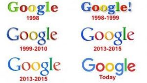
Google also changed their logo a few times. Six to be exact. It began with the ‘G’ and ‘l’ being green in 1998, it then added an exclamation mark for a year. The base design came in 1999 which stayed till 2010, the shadows were then dropped to make it look more simple. The present logo was a result of the Google Doodle campaign which saw the logo being stripped of its serifs.
4. Yahoo!
The exclamation mark of Yahoo is so iconic that it comes to mind anytime you imagine Yahoo. The new logo was released to the public in 2013 when Marissa Mayer took over as the new CEO. The logo was said to retain its roots but also showed the evolution of Yahoo.

5. Uber
In this age of social media, I guess the logo change of Uber met with the worst trolls and responses from people all around the globe. Although its CEO, Travis Kalanick tried hard to justify the change, Twitterati had none of it.
6. Twitter
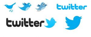
Now on to Twitter. For those of you who always wondered, that is, in fact, an actual bird in the Twitter logo. It is the Mountain Bluebird according to the designer of the Twitter logo. The logo went from being a slightly detailed picture of the bird with eyes and different colors to just solid block of blue color filling the bird’s design. It is supposed to display the simplicity of Twitter.
7. Apple
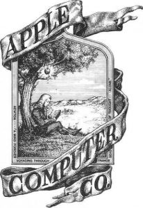
If you ever happen to see the original logo of Apple from a distance, you wouldn’t be able to figure out exactly what it shows. And it’s not your fault as it was pretty complicated. Jobs understood it within a year and changed it to the well-known logo we see now. The only dissimilarity was that it was a rainbow-colored apple and not the metallic one which came out in 1998.
8. Airbnb
This logo change was also met with a lot of criticism from the online community. The precious logo of Airbnb which displayed the lettering in a bright blue color, changed to something the people didn’t accept at one go. The logo is called Belo by Airbnb, but it shows something entirely different according to the users.
9. Verizon
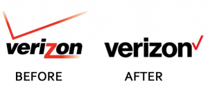
Verizon changed their logo from a double-checked bulky one to a sleek, single-ticked logo. The logo was considered as a rushed work because it was released after a day Google released their new logo. Also, the logo, which was supposed to come out at a press conference got leaked on Twitter way before its official release.
10. PayPal
PayPal’s logo change was also considered as a rushed by many critics. It was thought to be released just because PayPal had new payment products to be released soon, and a TV ad too. The new logo is said to be inspired by Google’s initiative to create a logo which will be displayed efficiently on mobile screens too.


