People and companies are taking so many ways to make their products and brand a very useful and effective means to the customers. This way, technology indirectly that helps in marketing, sales, and even productivity is color. The color of tech or brand is what makes them strong, weak or useful. Thus, let us take a peep into the important technologies hidden behind the psychology of colors.
1. RED
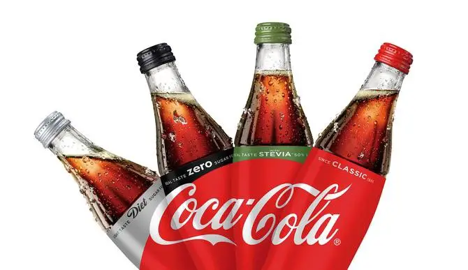
We are choosing the red color to indicate love, frustration or even hatred towards something. A person’s anger is generally as Red. Same way, when we think about a brand or a new technology the color itself indicates its individuality and the customers’ willingness about the product. Coca-cola, Honda, and McDonald’s are some of the brands which are using red as their logo. These are the most energetic and loving products all over the world.
2. BLUE

The color blue mostly refers to the efficiency, security, and productivity of some name. Few technologies usually use blue to indicate that their brands are safe and secure to people. Many of the industries would go with blue color for the indication of their efficiency and management. Technological brands like Facebook, IBM, and Dell are choosing Blue as the primary theme color.
3. GREEN

Green resembles energy, cleanliness, freshness, and pollution-free. Now the upcoming organic and agricultural brands and techs are using the Green symbols as their primary logo color. Some fitness technology is also using use the same. Green is a famous color in Subway, Starbucks, and Android to state instances.
4. ORANGE

The products which concentrate the fun and adventure would prefer orange color. Nickelodeon is a famous entertainment brand and technology that uses Reddish-orange as its color. The famous Fanta promotes fun side with orange tang while having this cool drink. Harley Davidson also uses dark Orange color for its branding.
5. YELLOW

Just like the bright yellow sun, the color will give brightness, freshness, traditionalistic, and warmth for the brands that use the tone. Technological brands like Nikon, Good year, and DHL use the yellow background for their logos.
6. PINK
Pink generally stands for girls. Most of the women-relative products use pink. The color refers to softness, care, and comfort. Notably, the cosmetic industry uses pink color. The most popular brand Barbie is full of pink.
7. BLACK

Black color refers to the strength and attraction to a product. The brand Lakme denotes the same aptly in two ways- One the background is fully black and with fonts in glittering gold, and in another one, the backdrop is pure white, and the font is in black. So technologies and companies that use black cleverly win the market with its boldness!
8. WHITE
Generally, white is preferable for a clean background. The popular brands like Apple and Nike use the black and white combination for their logos. White color stands for style and smoothness with black’s boldness and strength in the mix. Color may also be a reason for these brands to lead the industries.
9. PURPLE
When a brand or tech uses purple as its primary color tone, it means they want to differentiate their products in terms as nobility, wealth, and some premium quality. Products like Cadbury, Yahoo, and FedEx are some of the brands that use purple color and remain unique in their areas.
10. BROWN
The Brown color is mostly useful for the food technology industries. The brown is in the notion of honesty and dependability. The brands like UPS and M&M use the brown color for their logos and remain as the favorite in people’s mind and heart!


