New Microsoft Windows Logo for Windows 8
One of the newest and most notable features of the latest operating system set to be launched by Microsoft is, without a doubt, the new logo. Microsoft has done away with the well-known logo that has graced many a computer all over the globe.

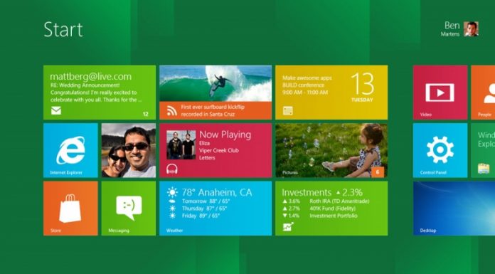
It is a common adage that if something that you have is not broken, do not fix it. Yet Microsoft is doing what is completely unthinkable, and doing away with a little piece of history, and changing the multi coloured ‘windows’ logo. That is not to say that the windows logo has not been subject to change over the years. The issue has risen from Microsoft’s change of direction to incorporate the new Metro UI and has thereby decided to be bold and leave history behind and embrace the new future.
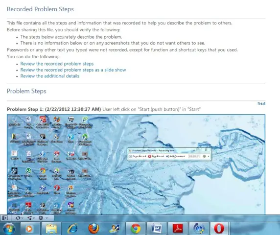
Recent reports in the media had the new logo leaked by some Chinese websites. Nevertheless, it was not until Microsoft itself confirmed the changes that a huge furore arose amongst those who have been loyal Microsoft users over the years. Questions are rising in many quarters as to the reason Microsoft decided to do away with a brand image that has influenced a generation. The single most recognisable aspect of Microsoft has been the windows logo on the taskbar, as your screensaver and as the image that greets you when you switch on your computer. Microsoft is doing away with all of those.
From now on, the little windows logo on your taskbar is relegating itself to the stockpile. In its stead is a new interface that allows you to move your mouse on the screen and an interface – much like that of the logo – appears and awaits your prompt. Microsoft says that the windows logo does not even look like a window but like a flag. However, many users have grown to know and love that so-called ‘flag’. One user said that no one really sees a flag but rather floating windows. As with all things, it all depends on your perspective.
It is that perspective that brings us here now; to reckon with a new future beckoning for the once famed Microsoft logo. To usher in a new future that promises new advancements to the famed Microsoft operating system. To see a brand that is constantly evolving to meet the needs of the consumer as we integrate new technological developments into our daily lives. Let us not forget also that as a business, Microsoft has to reinvent itself to meet the challenges of the competitive computer climate that they find themselves battling in. Let us therefore embrace change, and embrace the new Microsoft logo. It is a logo for the future.


