I’ve got to know about the new Norton Internet Security 2013 v20.0.0.106 beta. Does anybody know about the changes made to the interface of this version?
Answered By
parokv3
0 points
N/A
#142429
Norton internet security 2013 interface

As of now, Norton Internet Security made their latest version for the benefit of touch gadgets. There are minor modifications when discussing about their interface.
The design was less crowded as of its newest beta version compared to their last version (Norton Internet Security 2012) last year. Evidently, the size of its icons and other clickable settings for the interface turn out to be bigger that can tap by your fingers.
On top of that, even a simple and cleaner face of its main window; they did well for its features without slowing down the computer’s performance and improved responsiveness.

Norton internet security 2013 interface

Though I haven’t used the 2012 edition of Norton Internet Security because I’m still using Norton AntiVirus that time, I have used Norton Internet Security 2013 after I decided to shift from Norton AntiVirus. Now, since it is already 2014, I will simply compare the current version with Norton Internet Security 2012.
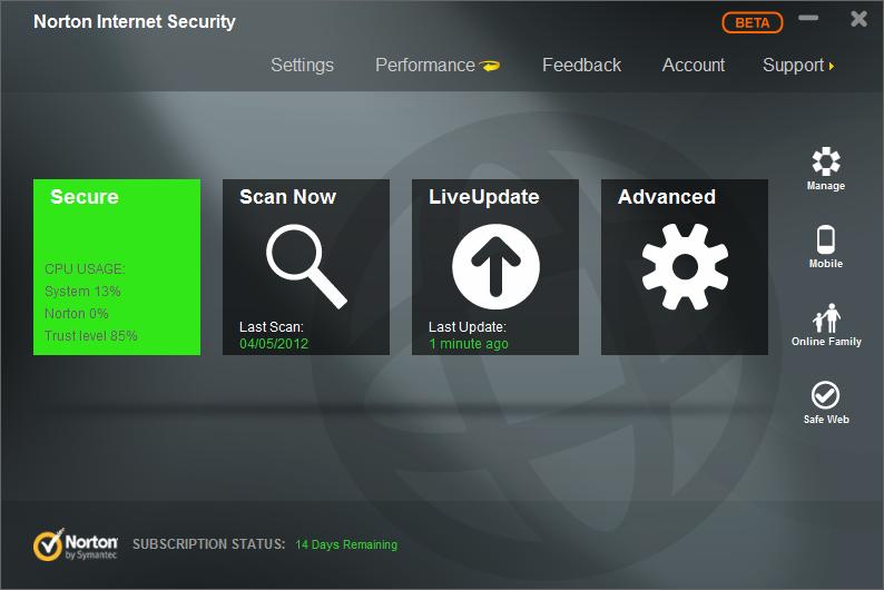
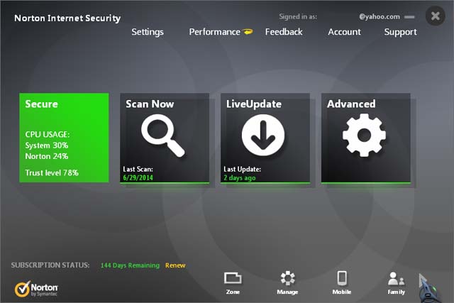
In Norton Internet Security 2012, the sidebar or the panel for the options Manage, Mobile, Online Family, and Safe Web is located or positioned on the right side of the interface like what is described in the image in the above post. In Norton Internet Security 2014, this panel is now located at the bottom of the interface.
Norton Internet Security has also added 1 more option in the panel, Zone, and the Online Family option is now labeled as Family. Zone is placed at the beginning of the panel. Also, they replaced Safe Web with Backup. See image.

There are also some slight changes in the icons used. In Norton Internet Security 2012, the magnifying glass image used in the Scan Now option has a straight handle with thin round frame. The arrow image used in the LiveUpdate option is pointing upwards. In Norton Internet Security 2014, the Scan Now option has a slightly shorter magnifying glass image with thicker handle and thicker round frame.
And the arrow image in the LiveUpdate option is now pointing downwards. Also, the email address used for the subscription is displayed on the top right corner of the interface while in the 2012 edition this feature is not available.


